Picture this: you walk into a shop and spot two similar products side by side. One has a plain, forgettable label. The other? A stunning sticker that catches the light just right. You know which one you’re grabbing. We’ve all been there, standing in the aisle, drawn to something we can’t quite explain. That’s not magic, it’s smart label design, and honestly, it’s way more achievable than you think.
Your Budget-Friendly Game Changer: Look, we get it. You’re pouring your heart into creating amazing products, and the thought of spending thousands on fancy packaging feels overwhelming. Here’s the thing though, food label stickers are your best friend. They let you play around, test what works, swap out seasonal designs, and keep things fresh without breaking the bank. No massive print runs. No warehouse full of outdated boxes. Just flexibility to evolve as your brand grows and your customers’ tastes shift.
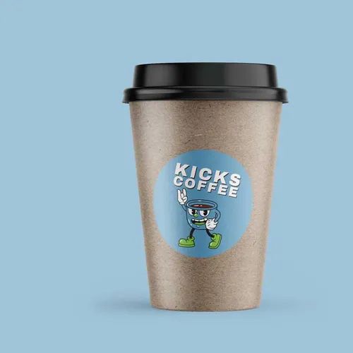
Why Circles Just Work Better Sometimes: Ever noticed how round sticker labels just feel… friendlier? There’s something about them that makes jars and bottles feel more handcrafted, more personal. They’re perfect for those gorgeous preserves you’re making or that small-batch hot sauce you’ve been perfecting. Stack them, overlap them, use them as seals, they add this tactile quality that makes people want to pick up your product and really look at it. And that moment? That’s when you’ve won.
Finishes That Make People Feel Something
- Matte, For When You Want Them to Touch It: There’s this thing that happens with matte labels. People see them, and their fingers just… reach out. The texture feels intentional, sophisticated, like you’ve thought about every detail. If you’re going for that artisan, handcrafted vibe, or maybe you’re all about organic, minimal, keep-it-real aesthetics, matte is your answer. Plus, under those harsh shop lights, matte doesn’t glare back at people trying to read your ingredients list.
- Gloss, Because Sometimes You Need to Shout: You know those brands that just demand attention? That’s gloss doing its job. Colours look richer, brighter, almost good enough to eat. If your product has personality, think cheeky hot sauce names or tropical fruit flavours that scream summer, gloss amplifies all of it. It’s unapologetically bold, and in a sea of boring labels, that boldness wins.
- A Little Metallic Magic Goes a Long Way: Want people to think “premium” without actually charging premium prices? Metallic touches are your secret weapon. A gold border here, some silver text there, maybe copper accents if you’re feeling fancy. These little details trigger something in people’s brains that says “quality.” You don’t need to go overboard, just strategic hints of shimmer can completely transform how your product feels.
Real Talk About Building Your Brand
- Tell Them Why You Started This: People are nosy. They want to know your story. Why did you start making jam at 3am in your kitchen? What made you think the world needed another chilli sauce? Your label has limited space, sure, but you can fit one genuine, heartfelt line that connects. That connection? It turns first-time buyers into loyal fans who recommend you to their friends.
- Don’t Reinvent Yourself Every Month: This is tough advice, because as creators, we always want to tweak and improve. But here’s the reality, your customers need to recognise you. That means keeping your core look consistent. Same colour palette. Same fonts. Same vibe. Different flavours can play with variations, but your “look” should be unmistakable from three metres away. Recognition builds trust. Trust builds sales.
- Actually Test Your Ideas (Seriously): This is where stickers save your sanity. Print a few different versions. Take them to the weekend market. Watch which ones people actually pick up. Ask your brutally honest friend what they think. You might be shocked, your favourite design might bomb, and that weird idea you almost scrapped? Could be the winner. Real feedback beats your gut feeling every single time.
The Stuff Nobody Talks About (But Should)
- Labels That Fall Apart? Total Brand Killer: You’ve spent months perfecting your recipe, and then someone’s label peels off in their fridge. Disaster. Your sticker needs to survive real life, condensation, sticky hands, bumpy deliveries, sitting in direct sunlight at markets. Waterproof materials aren’t optional for food products. UV-resistant inks aren’t fancy extras. They’re the difference between looking professional and looking amateur.
- Getting Sticky With It (The Right Way): Not all surfaces are created equal. Glass is smooth and easy. Textured cardboard? Trickier. Plastic containers? They need their own approach. If your adhesive isn’t matched properly to your packaging, labels peel. Products look dodgy. Customers lose confidence. Getting this technical bit right means your label stays put from your kitchen to their pantry, looking fresh the whole journey.
Your label isn’t just decoration, it’s doing the selling when you’re not there. Smart food label stickers and clever round sticker labels level the playing field between you and the big brands with massive budgets. Every choice you make, matte or gloss, bold or subtle, playful or sophisticated, shapes how people see your quality before they’ve even tasted what’s inside. Ready to create labels that stop people mid-scroll through the supermarket aisle? Chat to our team and let’s make your products impossible to ignore.
Featured Image Source: https://degqkf7c4iqz7.cloudfront.net/labexonpr/images/opt/products_gallery_images/Paper-Labels-Coffee-Cup.jpg.webp